If you haven’t read Part 1, I wrote it 2 weeks ago and you can view it here.
By now, you should have the basic framework of your WordPress blog set up and running with the proper plugins and monetization tools in place.
The Report
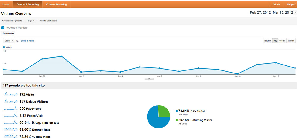
As promised, here is my Google Analytics screenshot since the time I wrote Part 1.

According to this, I’m averaging 11.5 visitors per day. Not much of an improvement however that day where you see zero visitors was a day I had taken my site down to do some maintenance. Still no profits to report either. Probably won’t see any until I’m averaging 100 visits per day.
Between the Part 1 write-up and this post, I’ve written 2 posts – sticking to my 1 post per week. I have other sites that require a lot of my time but I know I can make this one work. After all, I’ve found success with some of my other projects.
Blog Theme & Design
I’m going to discuss a very key aspect of blogging in this part of my case study and that is the overall visual design, functionality and theme of your blog.
Have you ever visited a website where the information was scattered everywhere, colors were being used as if they were going out of style and navigating it was as hard as the structure from the Cube movie? If so, you likely didn’t stay there very long even if they wrote great content. For many people, reading a blog is like sitting in their favorite cafe, it has to feel inviting and comfortable.
Key Elements To Take Into Consideration
I’m really anal when it comes to designing my sites. I want them to deliver my content in a way that makes it almost too easy for my visitor to sit for extended periods of time and get lost in my world of writing. Here are the points I look at when choosing a theme or designing my own theme for WordPress.
- Clean presentation – Your theme should come off as a well-groomed spokesperson. After all, this is what sets the initial impression with your visitor.
- Organized content – No one likes content that is scattered all over the pages. Make sure your theme has the ability to manage you content in a nice/neat ordered way. John Chow’s blog is a great example of being organized!
- Standard widgets & functions – Any theme you choose should come standard with a related posts feature for below your posts, recent posts widget, popular posts widget and recent comments widget. Yes, you can get all of these in the form of a plugin but having that many plugins really drags down your sites’ loading speed. Also, they are never designed as well as the widgets designed by the authors of the premium themes. The purpose of these features are to keep your visitors discovering more content and ultimately spending more time on your blog.
- Sociability – Most premium themes nowadays come with their own social sharing features. This is great since it cuts another plugin out of the picture. I cannot stress how important it is to allow your readers to share your content on social networks. I use the traffic of social networks to get all of my web properties up and running until they get indexed fully by the search engines.
- Expandability – Try to think about the future of your site when designing it. I’ve made the mistake before of starting out with too simple of a theme only to find myself running out of room for menus, widgets and advertising space. Let me tell you that it’s not fun switching themes on a huge site when you have to go through every post to check if the formatting & images are alright and to change all of your shortcodes.
- Shortcodes – These add great style to any blog and just about every premium theme has their own set of shortcodes. They will also make your life simple when trying to design an attractive page.
- Clean coding and SEO – WordPress is great for search engine optimization right out of the box. However, if you throw a theme on it that has Einstein’s thoughts for coding in it, then your site will be slow. Pick a theme where the author has taken SEO and code structure into great consideration. They will normally mention these features in their descriptions if its been implemented.
Part 2 Done
That’s it for my theme and design write up. If you’re having trouble finding a good theme to start with, I use ThemeForest for all of my theme needs. Their marketplace is nothing short of amazing and you’ll feel like a kid in a candy store.
I will most likely be writing part 3 within another 2 weeks so stay tuned! Hopefully by then we are looking at some real numbers.


